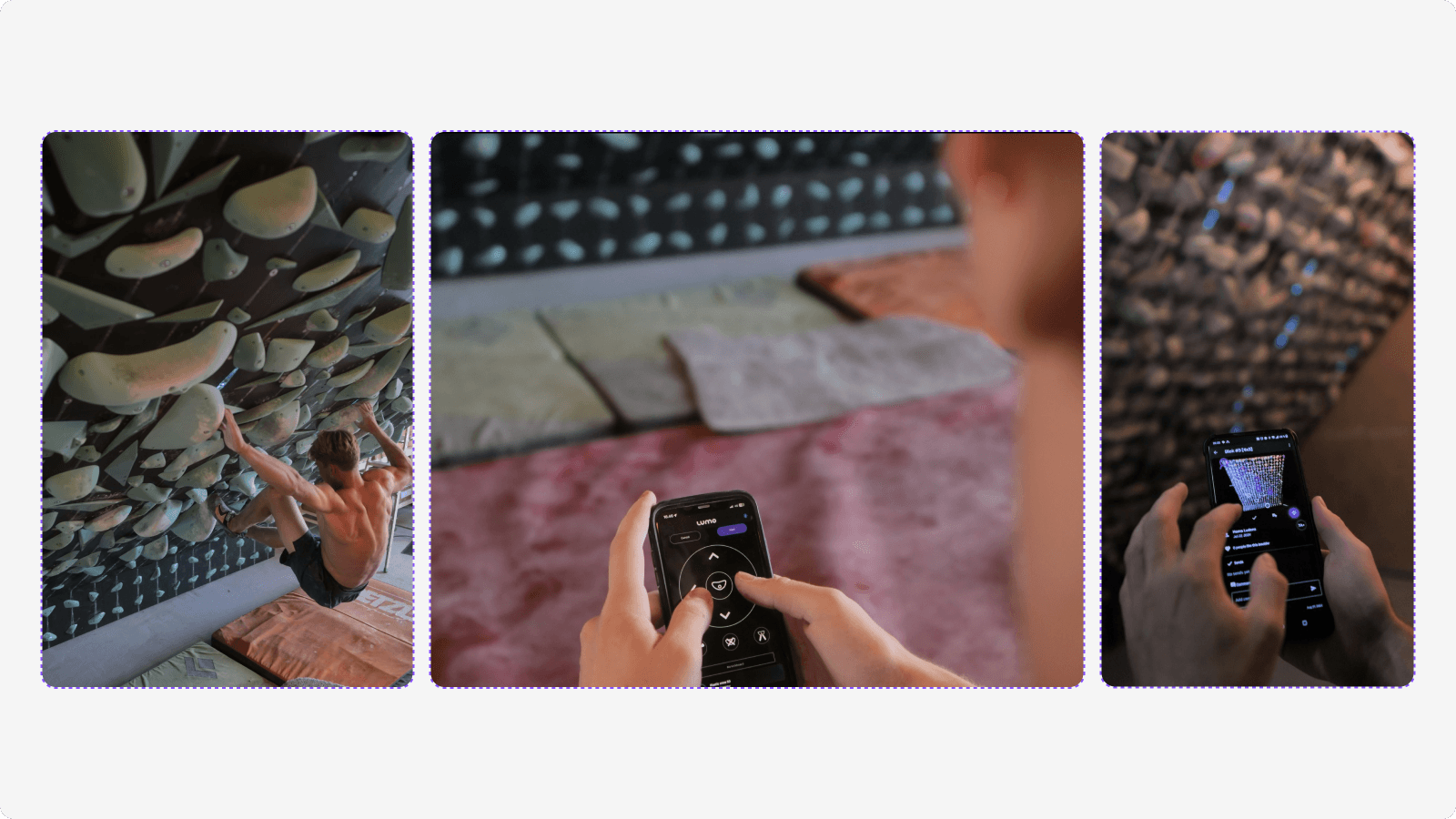
In this project, I led the redesign of LUMO’s most-used feature: the Climb tab, where users spend over 70% of their time. Feedback showed climbers struggled to filter through climbs efficiently—an issue that created friction in their training experience. My primary focus was to streamline filtering and browsing, making it faster and more intuitive for users to find climbs that match their goals.
Role
Product Designer
Company
Lumo Aps.
Duration
3 months
Designing ‘with’ users, not ‘for’ users
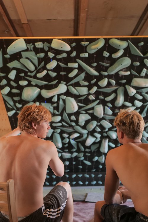
Our app usage statistics show that users spend a significant amount of time in the Climb tab, around 72%. When we gathered feedback from climbers about their experience in this section, it became clear that filtering through climbs can sometimes feel daunting.
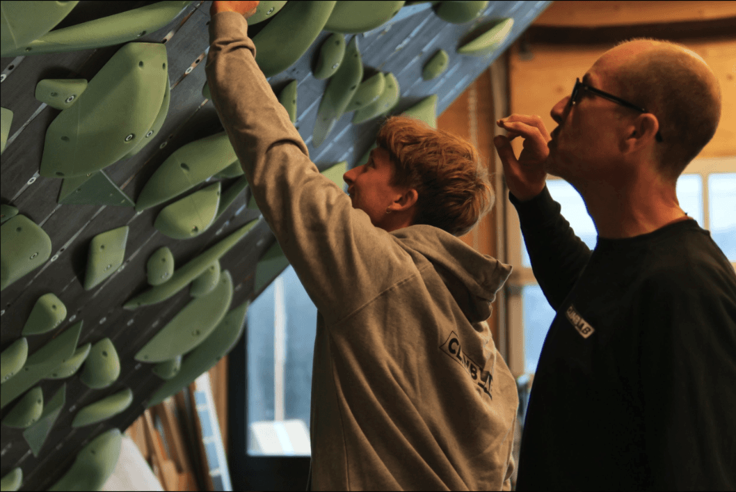
To address this, we took proactive steps, collaborating with our users to create a more intuitive filtering system that helps them focus on what truly matters—climbing and enjoying the app.
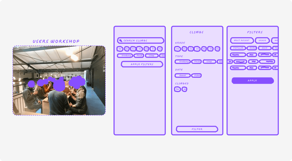
During our workshops with the climbers, we created several wireframes that introduced new user flows for climbers, particularly in terms of filtering options. By utilising low-fidelity mockups from the outset, we could validate our assumptions early on and define the key functionalities required for the next iteration of the app.

The insights gathered from user interviews and app usage data enabled us to compile a thorough list of new functionalities required to enhance the user experience.
Essential features right at the user's fingertips
I redesigned the Climb tab based on the latest requirements, providing users with essential filtering options that enhance their browsing experience. The layout is flexible, accommodating various needs and ensuring smooth navigation through climbs.

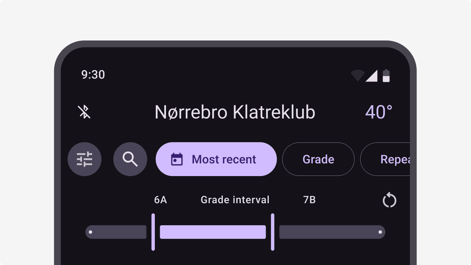
The main screen filter navigation showcases a horizontally scrollable design with clear functionalities, making it simple for users to sift through climbing options.
The 3-state button provides quick filtering options, allowing users to toggle between Default, State 2, and State 3. This feature helps them easily find the climbs that interest them without lengthy filter forms.
Scaling with the community in mind
With over 360 community-created climbs and more than 121 active users, we needed a systematic approach to enhance the UX of our app as we plan to introduce additional boards. The layout should be structured yet adaptable to accommodate various board types, LED interactions, and ensure a seamless user experience.
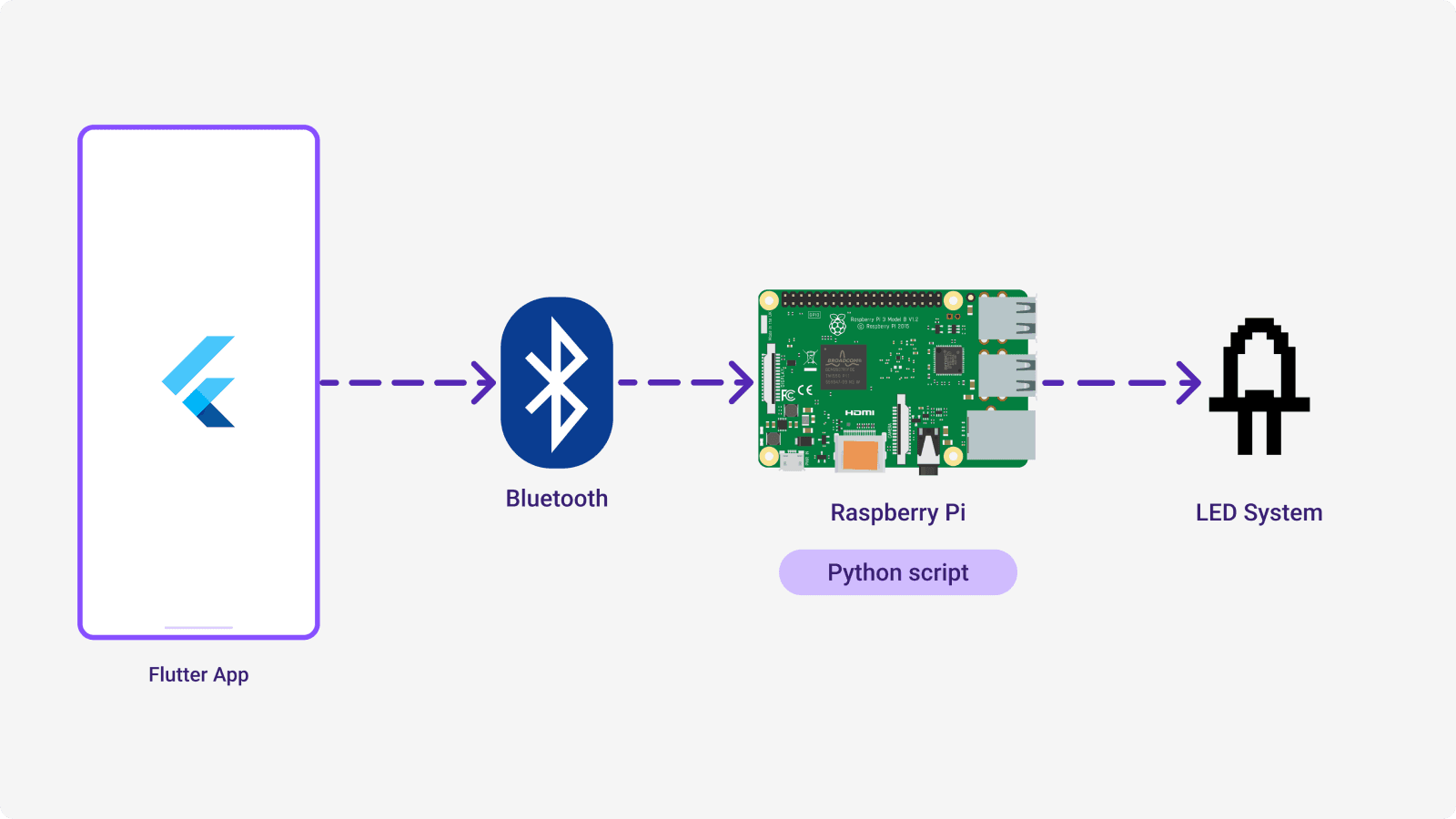
We implemented Google's Material 3 design system, customising it to ensure visual consistency across our app while also optimising for Flutter development. This enables us to effortlessly execute Python scripts that communicate with the Raspberry Pi controller for the LED system used in the climbing boards.
Users can now effortlessly explore climbs, concentrate on their training, and interact with problems set by the community.