My Role
Product Designer
Interaction Design, Visual Design, UX Flows, Prototyping, Usability Testing
Company
Lumo Aps.
Duration
3 months
Tools
Figma, Prototyping, Google Material Design, Flutter, Python
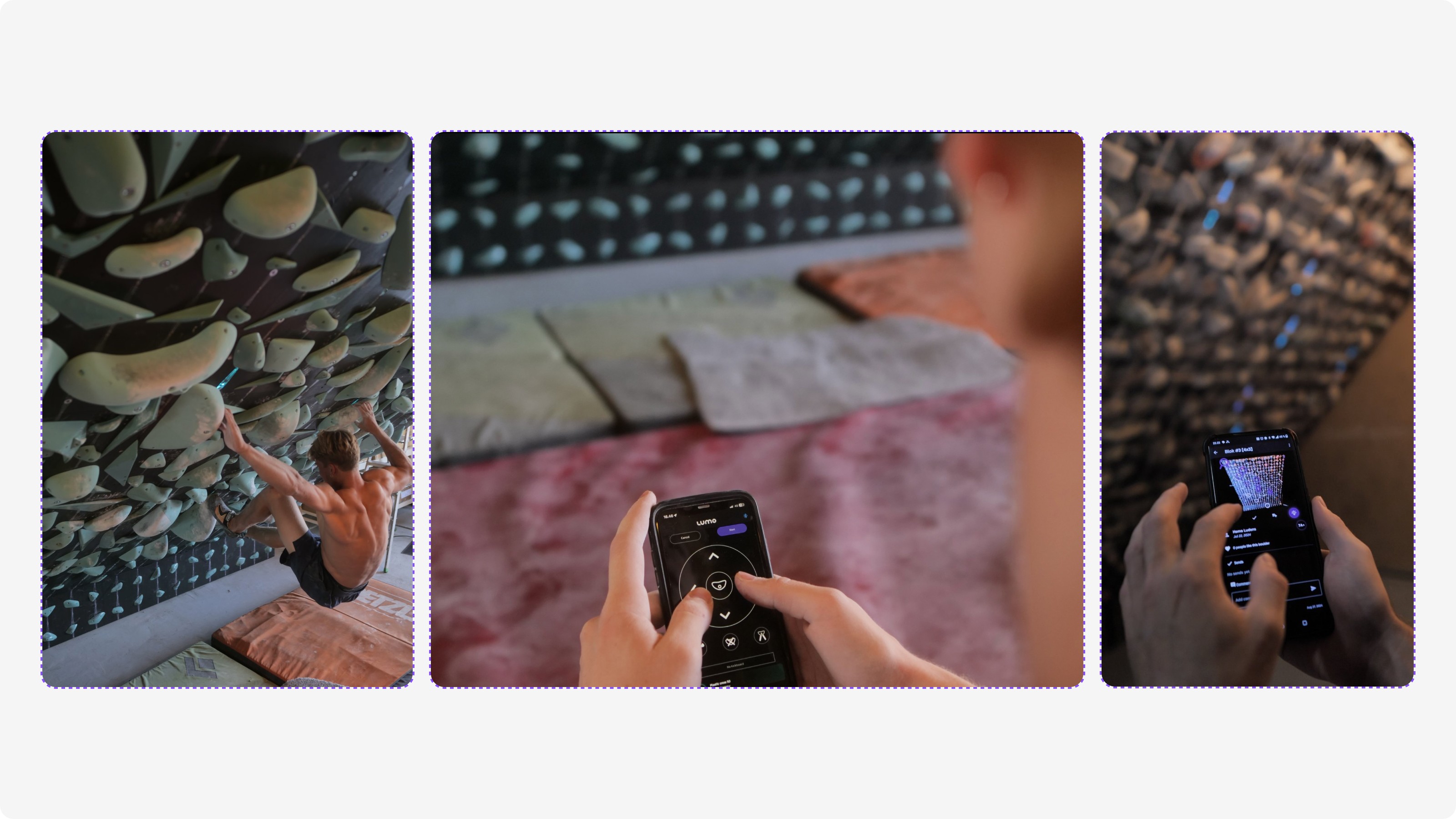
Lumo helps climbers discover and engage with climbs on an interactive board in a gym. As the community and climb library grew, the challenge became simplifying choice—without slowing climbers down or breaking their flow.
Usage data showed that climbers spent nearly 72% of their time in the Climb tab. Despite its importance, feedback and observation revealed that navigating and filtering climbs often felt overwhelming—especially as the number of routes continued to grow.
The problem wasn’t a lack of features. It was the effort required to find the right climb at the right moment.
Stepping into the gym
To understand the problem beyond the screen, I worked directly with climbers in their environment. Watching climbers move between the wall and the app made it clear that filtering happens in short, focused moments—often between attempts, mid-conversation, or while resting.
As a climber myself, I stayed conscious of bias. The goal was to observe shared behaviour, not design around my own habits.
Making decision-making visible
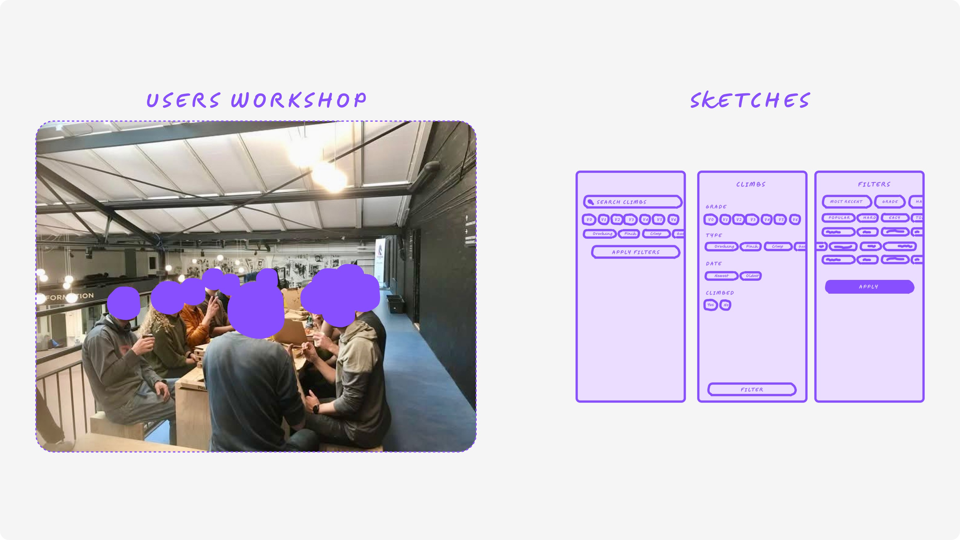
We ran workshops with climbers using low-fidelity wireframes and simple mapping exercises. Instead of asking what features they wanted, we asked them to show how they decided.
By visually mapping their steps—what they notice first, what they ignore, and when they commit—we surfaced patterns that don’t usually appear in interviews alone. These maps became the foundation for the redesign.
Structuring complexity
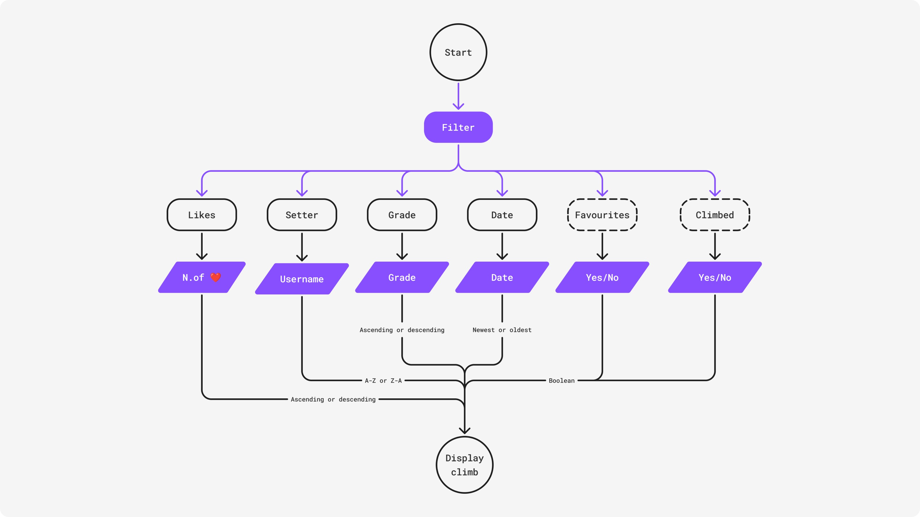
To ground the workshop insights, we paired them with in-app data. This helped confirm which filters mattered most and which ones added noise.
The direction became clear: reduce depth, surface the essentials, and let climbers refine choices gradually rather than all at once.
Bringing filters into the flow
The Climb tab was redesigned so filtering happens directly within the main view. A horizontally scrollable filter bar keeps options visible without pulling users into separate screens or heavy menus.
This approach matches how climbers think—quick adjustments, minimal interruption, always staying oriented.

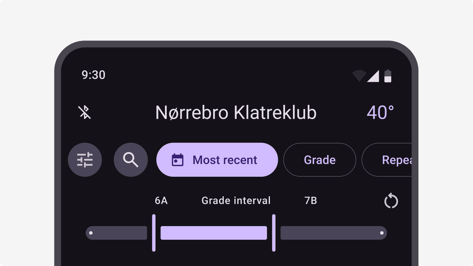
A key interaction was the three-state toggle. Instead of binary choices, climbers could move through states with a single tap, enough control to be useful, without slowing them down.
It reduced friction while still supporting more nuanced filtering.
Testing for clarity and usability
We tested the new flow using an interactive Figma prototype in guided sessions. Even without the physical LED boards connected, testing quickly revealed what worked and what didn’t.
Climbers described the experience as faster and cleaner. They also pointed out where things felt unclear—and asked for features like saved filters, which became an obvious next step.
Based on testing, we introduced saved filters, clarified toggle states through icons and language, and refined layouts to work better across different board types.
Many of these updates are now live, improving both clarity and confidence when browsing climbs.
Measuring impact
Early results were encouraging. Bug reports dropped noticeably after release. Observed filtering tasks took less time. Engagement with the filter bar increased, suggesting climbers were actively using—and trusting—the new interactions.
Scaling with the community in mind
With over 900 community-created climbs and more than 200 active users spread across 3 different climbing gyms, scalability was a core consideration. The UI was designed to remain structured yet adaptable, supporting different board types and LED configurations.
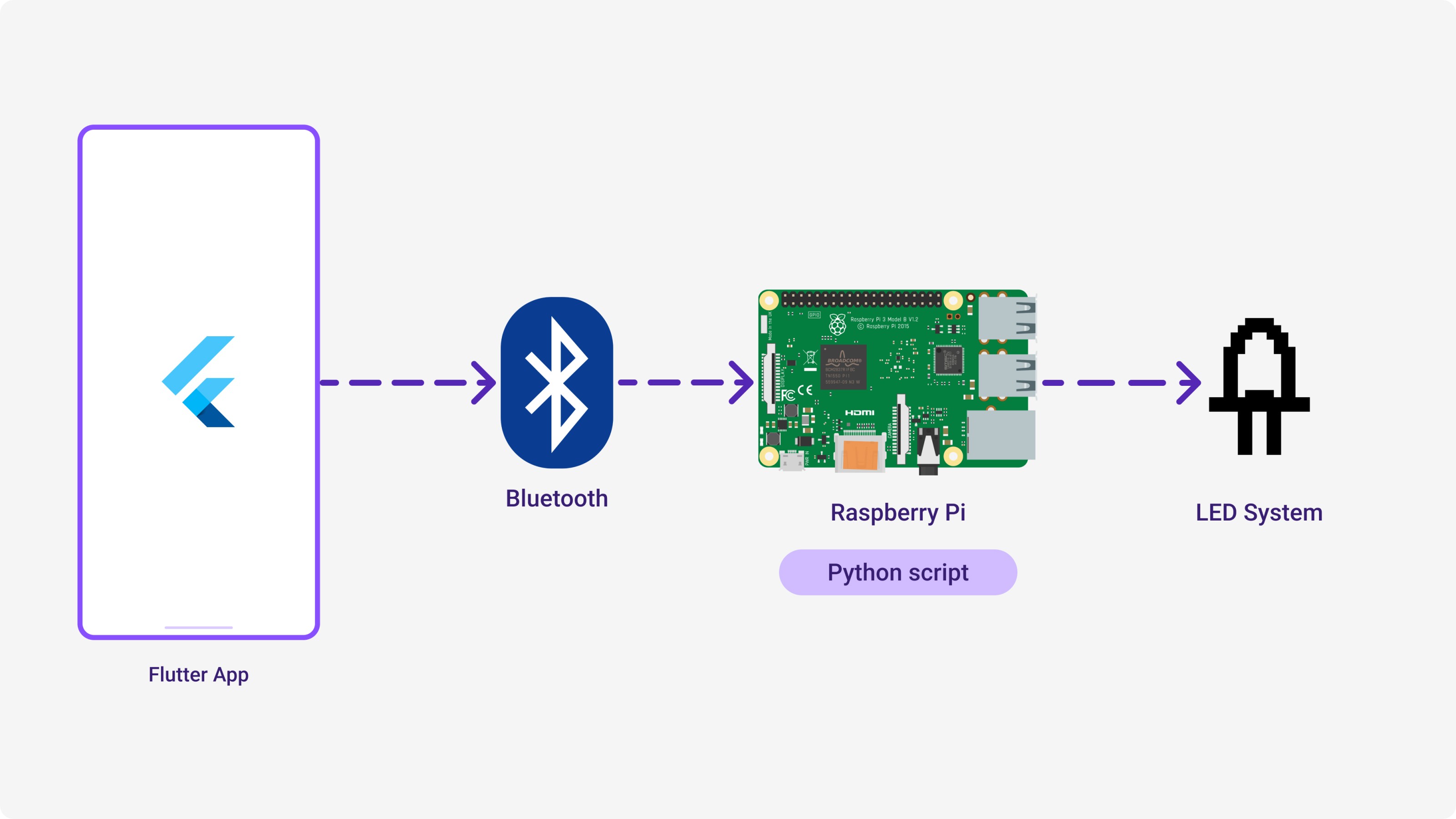
We aligned the UI with Google’s Material Design system, customized for Flutter development and integration with Python-controlled hardware. This gives us a solid foundation as the platform continues to grow.
What's next
This project reinforced the value of designing alongside users, especially in a community-driven space. By listening closely and testing early, we were able to ship changes that made the experience calmer, faster, and more focused.
The Climb tab will keep evolving—but the approach stays the same: start with real behavior, design with restraint, and let the product grow with its users.


